The Website Services team at NHS England are testing early designs to understand how you find information. Your views will help us check our ideas work. Sign up to take part in our user research

NHS Frontend Blocks

NHS Frontend Blocks

NHS Styled Blocks for NHS WordPress Sites

NHS Styled Blocks for WordPress using the Gutenberg editor, based on the excellent work from the NHS UK Frontend Library. These blocks mean your WordPress site can offer the latest care cards, site promos and info panels to your users, and that all of this content will be styled to match the NHS branding guidelines.

This plugin is designed principally for use by NHS organisations, but can be used by anybody.

Below is a list of blocks that are used on the NHS WordPress platform with full video tutorials on how to use them.

Action Link

An Action Link will enable you to insert a piece of text and link which will link to a specific page within your site.

Enter /Action Link or click on the Add Block Button + to add this block.

Action Link Block
Back Link

The Back Link Block adds a simple back to page navigation on the bottom of your content page.

Enter /Back Link or click on the Add Block Button + to add this block.

Back Link Block
Button

The Button Block is part of the NHS Blocks which has been designed to match NHS digital layouts.

Enter /Button or click on the Add Block Button + to add this block.

Button Block
Card Region

The Card Region Block is a great way of adding content in multiple sections of your site. You can style your cards with 4 different colours.

Enter /Card Region or click on the Add Block Button + to add this block.

Card Region
Contents List

The Contents List Block when added will give you a ordered list where you can add links to various pages. You can add as many Content Lists as you want.

Enter /Content List or click on the Add Block Button + to add this block.

Page List Block
Contents List within a page

This feature is very handy if you have a large amount of content on your page. This feature will add a heading block, when you are adding content with a header (h2) and click on update header block it will populate your headings inside the block. You can click on the heading inside your header block and the page will scroll down to that header with your content.

Enter /Contents List within a page or click on the Add Block Button + to add this block.

Contents list in a page block
Dashboard Navigation

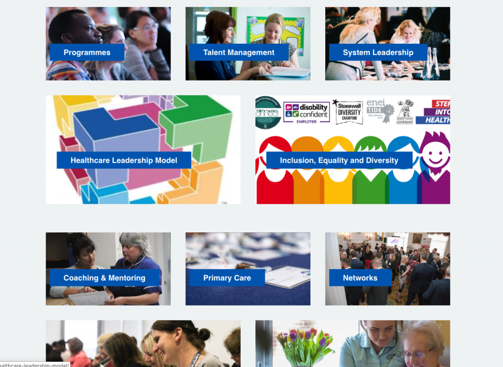
The Dashboard Navigation Block allows you to add panels that you can add links to navigation around your site. You can add images to your panels to make it stand out more.

Enter /Dashboard Navigation or click on the Add Block Button + to add this block.

Dashboard Navigation
Do and Don’t List

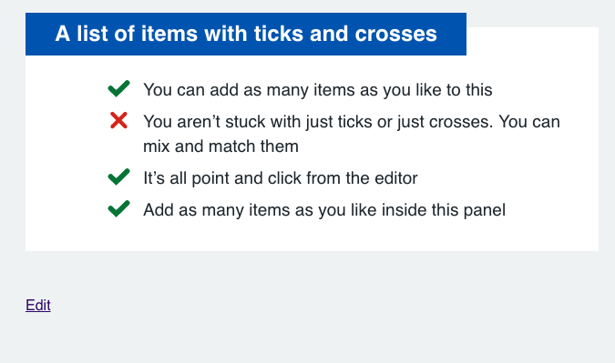
The Do and Don’t List is a simple list with crosses and ticks with text.

Enter /Do and Don’t List or click on the Add Block Button + to add this block.

Do and Don’t List
Grouped Items

A Grouped Items Block will organize content in a grouped column. There are a few templates to select from.

Enter /Grouped Items or click on the Add Block Button + to add this block.

Grouped items
Hero Block

The Hero Block add a static home page banner with the ability to add a background image and text within a block. You can change the background color and the text.

Enter /Hero Block or click on the Add Block Button + to add this block.

Hero Block
Pagination

The Pagination Block adds a next and previous link to the bottom of your page. This is handy if you want to skip through a page that is related to your current page.

Enter /Pagination or click on the Add Block Button + to add this block.

Pagination Block
Panel Region

The Panel Region Block will add a title, block of text and a button. You can modify the button by adding a link and changing the colour.

Enter /Panel Region or click on the Add Block Button + to add this block.

Panel Region

The Partners Logo block is a great way of adding a block of logos on the bottom of your site that link to different URL’s

Enter /Partners Logo or click on the Add Block Button + to add this block.

Panel Region
Promo Region

The Promo Region Block adds various tile boxes which you can add content, images and links to. Usually you will need to add columns first then you can add the Promo Region blocks.

Enter /Promo Region or click on the Add Block Button + to add this block.

Promo Region
Review Date

The Review Date Block simply puts a last review text to your content page. For example Last Reviewed : <your name> <date and time>

Enter /Review Date or click on the Add Block Button + to add this block.

Last Reviewed
Simple Quote

The Simple Quote Block is very similar to the normal Quote block. The only difference is the styling of the block.

Enter /Simple Quote or click on the Add Block Button + to add this block.

Simple Quote
Simple Reveal

The Simple Reveal Block is commonly used when you have a lot of content to add to a page. You can add a title and content to the Reveal block.

Enter /Simple Reveal or click on the Add Block Button + to add this block.

Simple Reveal
Stripes Block

The Strips Block adds 2 different coloured sections to your content, white and grey. It simply adds a background colour to your content.

Enter /Stripes Block or click on the Add Block Button + to add this block.

Stripes Block