Re-Size your Images to Fit Various Devices
In order for your images fit correctly on your pages you will need to make sure that your images are sized correctly so they fit on all devices for example desktop, tablets, and mobile devices.
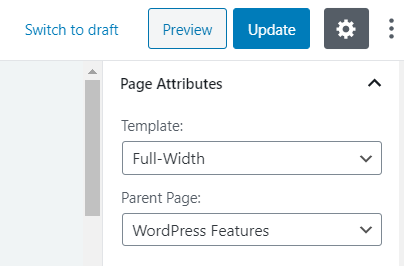
WordPress pages have 2 different templates full width and default. The default option enable you to have a sidebar on the right hand side with the content area on the left side. The full width option allows you disable the sidebar on the right and have a full width content page.
Here are the specifications to enable images are displayed correctly on your pages:
Full Width Template:
2 Column – 470w x 220h (50% page width image) http://prntscr.com/qti7py
3 column – 350w x 200h (33% page width image) http://prntscr.com/qti7py
Default Template:
2 column – 350w x 200h
3 column 350w x 200h
For more help on adding images please see the following page.
Responsive Images for Hero Block
When adding a Hero Block to your pages you must ensure that the image height is 330px. You should re-size your Hero Block images as 1920px by 330px.
There are numerous free sites that can re-size or crop your images. I highly recommend the following free site
The below video will cover all aspects of the above.
Responsive Images